formerly Shaw Paints Ltd


Colour & Style Guide
Our blog contains tonnes of inspiration, style and paint product advice to help you find the perfect scheme for your project

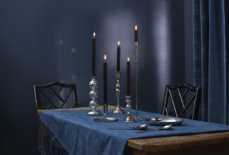
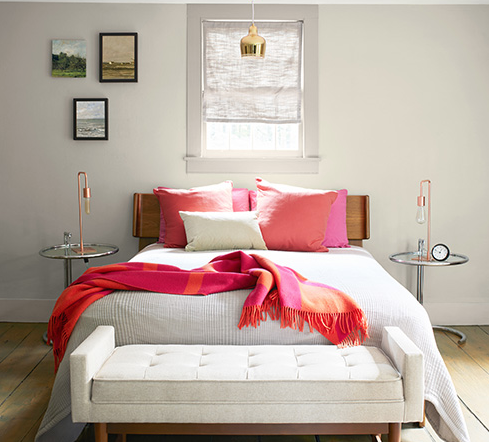
An unexpected pop of red
The theory goes that adding anything that's red, big or small, to a room where it doesn't match at all, will automatically look better. More and more design enthusiasts are welcoming this energetic colour choices as a way to inject personality in their homes. It's all about being playful, so get ready to have some fun.
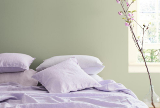
Colour Psychology - Purple
From gentle lilacs and muted mauves to bolder berry tones and deep aubergine, purples can either elevate a room with rich drama or be subtle and calming, conjuring positive energy and evoking a sense of ease.
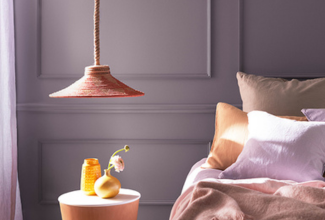
Gently Bring In Spring
Bring a sense of new-season freshness into your home with some springtime inspiration from guest editor Joanna Thornhill.
Breathe And Relax - Serene Colour Schemes For Your 2024 Projects
Create a calming sanctuary with our guide on how to combine soothing colours to create a sense of tranquility and harmony.
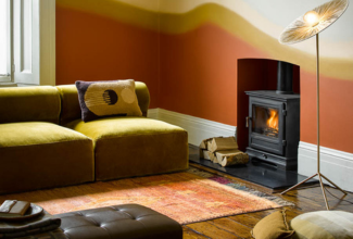
Colour Psychology Series : Orange
Orange combines the cheerful optimism of yellow, alongside the vibrancy and strength of red. The result is a warm and inviting colour that can evoke feelings of happiness, positivity and energy.
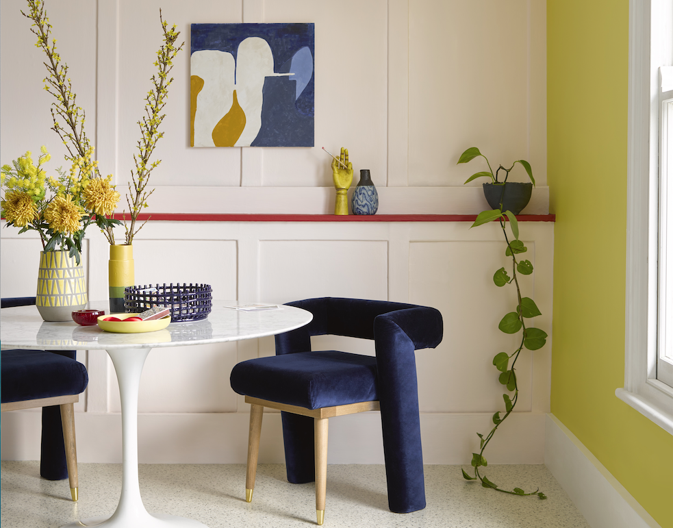
Embracing Bold Colours for Maximum Impact
Guest editor Claudia Baillie explores how the strategic use of powerful shades can evoke a feeling of sophistication and warmth.
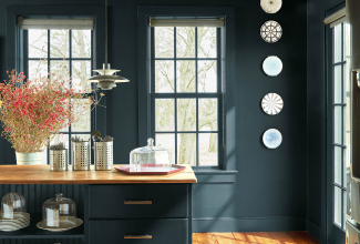
Blue Nova 825 is the Colour of the Year 2024
An intriguing mid-tone blue that is inspired by the brilliance of a new star formed in space. Blending violet and blue together to create an elevated sumptuous colour that has an other-worldly quality that is both enchanting and reassuring.
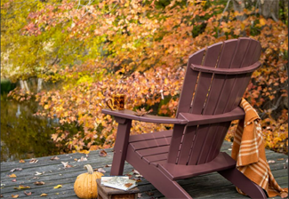
Colour inspiration for Autumn-Winter 2023
With the arrival of autumn, the comforts of our indoor spaces once again become the focus of our daily lives. Discover inspirational ways to update tired corners and faded colours and to add warmth and texture to our homes.
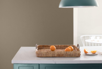
Colour psychology series : Brown
From soft tan to rich chocolate, the versatility of brown is endless. Much like the earth, brown is solid and reliable and creates a strong sense of security, comfort and peace.
How To Pick The Right Paint Sheen For Your Project
A handy guide that explains what the sheen of a paint is, what the options are, and where each work best.
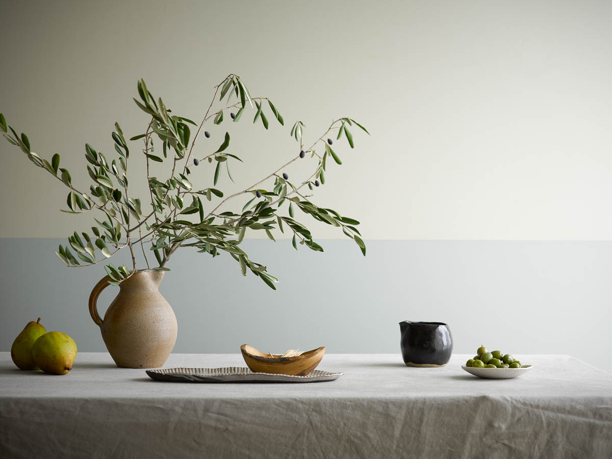
Ring the changes with new neutrals
Our guest editor, Emma J Page, explores how to move beyond classic off-white and beige colour schemes to create a restful canvas that still carries a little punch.
Colour inspiration for summer 2023
Make every day feel like a summer's day with our seasonal colour inspiration.
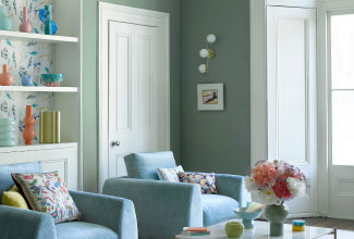
Colour Psychology Series : Blue
Arguably one of the most loved colours in the world... Explore ways to use blues to create calming and serene schemes for your home.

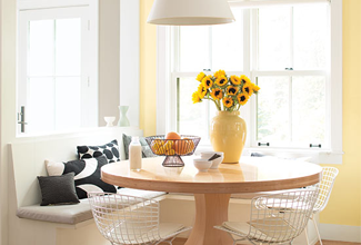
Decorating with this season's primary brights
Decorating with purer, punchier shades is having a resurgence - we'll show you how to incorporate these vibrant, lively hues in a wonderfully sophisticated way.

Decorative paint techniques
Decorative paint techniques are set to be big in 2023. Whether it's the geometric patterns, two-tone features or freehand motifs, it seems our inspiration knows no bounds.

Colour Psychology Series - Pinks
From vibrant, fearless and eye-catching hues to the 'new neutral' barely there plaster toned walls, the versatility of pinks has the power to uplift, excite and calm us in one fell swoop.
Inspirational colour palettes for winter 2022
Discover this season's inspirational colour palettes to fill your home with warm, nourishing colours that burst with optimism and individuality.

Raspberry Blush 2008-30 is our 2023 Colour of the Year
A vivacious shade of coral tinged with pink that invites you to embrace self-expression and immerse yourself in hues that make a statement.

Why Tonal Decorating Is The Short Cut To A Harmonious Home
Guest blog by Jessica Doyle, Design And Interiors Editor At The Telegraph.

How To Make A Room Feel Bigger
Guest blog by Kate Home-Roberts from CharlesTed Interiors sharing her tips for using colour, light and carefully chosen accessories to make a space feel bigger.

Best paint colours for east facing rooms
Discover how to take account of cool east-facing light when choosing paint colours.

Colour Psychology series : Yellow
From rich and decadent gold tones, to pale, buttercream hues, yellow paint colours lift spirits while providing warmth and comfort.
Zoning - how to create defined areas in open-plan spaces
A guide to creating harmonious and well balanced zones in multi-functional or open-plan spaces.
Sally Cullen shares inspiration for Spring 2022
A guest blog by You Magazine's Interior Editor, Sally Cullen, who shares some inspiring schemes for Spring 2022.
Colour Trends for Spring 2022
From calming neutrals to experimenting with bright and bold colour, we've rounded up the top colour trends for spring 2022.

October Mist is our Colour of the Year 2022
Evoking the silver-green stem of a flower, this gently shaded sage quietly anchors a space and inspires endless colour combinations to refresh your space.
Our top 10 "greige" colours
Discover our best selling greige colours - warm, muted neutrals that are perfect for creating contemporary and harmonious schemes.

Aegean Teal 2036-40 is our Colour of the Year 2021
Take a moment to reflect and reset. Intriguing, balanced and deeply soothing, the Benjamin Moore Colour of the Year creates natural harmony.

Discover the Benjamin Moore Color Portfolio App
Simplify colour selection and eliminate guesswork with our new app

Choosing the Right White
A guide to our stunning palette of whites

Love the colours in your home
The Colour Handbook - a guide to selecting colour

How to choose the perfect grey
Finding the perfect grey can be a minefield - so we've featured our designers' favourite greys to help you pick the best one for your home.

How to create colour flow throughout the home
A guide to the concept of colour flow and a how to build how to build a harmonious colour palette

Give your rooms the edge
Inspiring ways to use colour on your woodwork

How to pick the perfect paint colour for the light in your room
Our tips on how to pick the perfect colour for your space, taking into account natural and artificial light.

How to layer neutrals to create a timeless, sophisticated scheme
A guide on how to combine and layer colours from our neutral palette to create a harmonious look.


© 2015 - 2024: All design, text, images and the selection, alteration and arrangement of those elements are the copyright of Benjamin Moore UK Ltd or mentioned third parties, reproduced with their permission.
