Colour Handbook
Colour really does make the room. The perfect shade and finish can enlarge a small space, bring in more light, or deliver that kick of energy you need with your morning coffee.
But finding the perfect colour, well that's not always so easy. Our Colour Handbook is packed full of essential tips and hints to help you feel confident you'll love the colours you live with.
Demystify the Colour Wheel
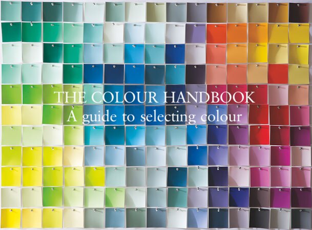
To get started, take a look at a colour wheel: Warm reds, yellows, and oranges congregate on one side, while cool lavenders, blues and greens are on the other. Pale tones and "hints" are at the centre of the wheel while saturated shades are found around the edge. Creating a palette within one half of the wheel tends to be more harmonious. But pairing two colours that stand opposite one another adds a dash of invigorating tension. Which do you prefer?
Helpful colour wheel terms:
A monochromatic colour scheme uses shades of the same colour with varying levels of saturation.
An analogous colour scheme uses adjacent colours on the colour wheel, such as blue and teal.
Complementary colour schemes (as in "opposites attract") include two colours that are opposite to each other on the colour wheel.
"Every time you walk into a room,
colour impacts how you feel",
Helen Shaw, Marketing Director
The Psychology of colour
You want to love the colours that surround you. So when imagining (or reimagining) a room, remember to think about the influence colour will have on the mood of the space. The effect can be subtle or dramatic. It can encourage tranquility or boost energy, even make you feel optimistic or more introspective.
4 basic colour groups help us to understand how colour can influence mood.
Pales
Their light, airy qualities make pale hues feel uplifting. Pale colours like dusty lavender, ballet pink and sky blue are comfortable and easy to live with. They feel positive and encourage expression, while enhancing other colours.
Be inspired by our collection flattering pales here.
Take a look at our Fresh Pales Colour Book here.
Neutrals
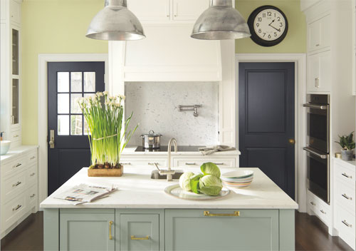
Its no surprise that earthy, nuanced colours keep you grounded. Neutrals go beyond grey and brown into earthy hues like slate, clay, sand and ochre. Colours in this family can be warm or cool, but they are always reliable and levelheaded. And becaise they transition beautifully with shifting light, they're a good choice for rooms used throughout the day.
Be inspired by our collection nuanced neutrals here.
Take a look at our Timeless Neutrals Colour Book here.
Whites
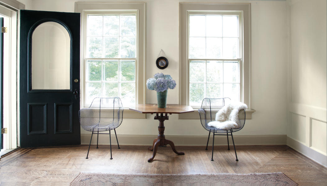
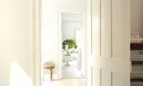
Pure and pristine, these timeless colours offer a blank canvas to express your style. Whites can easily feel contemporary, traditional or anywhere in between. Its an honest, harmonious family of colours and a great place to start, as they complement any style. You might call t a perfect backdrop for the life happening around it.
Be inspired by our collection contemporary and classic whites here.
Take a look at our Gentle Whites Colour Book here.
Deeps
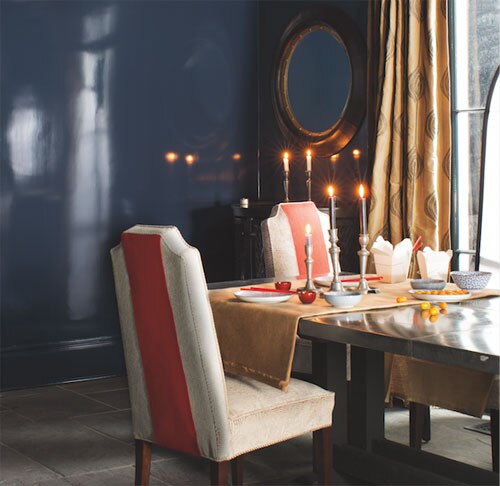
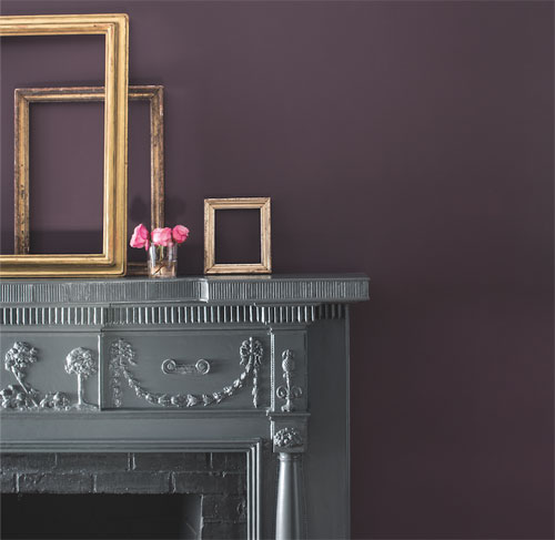
Bring drama to a room with colours that are rich and mysterious. Violet, onyx, sapphire and ruby - even the names evoke something dramatic. Deeps colours dissolve boundaries and create depth. They are the opposite of understatement and can fill a room with energy, creativity and confidence.
Be inspired by our collection striking deeps here.
Take a look at our Dramatic Deeps Colour Book here.
"Time of day matters when it comes to assessing colour",
Carl Minchew, VP Colour Innovation and Design
The Theatre of Light
Light in a room changes many times throughout the day. From the natural light of early dawn to the artificial light of nightfall, the interplay of light and colour is a crucial component when it comes to choosing your perfect paint colours.
Experimenting and observation is key.
To make sure you choose your colour with confidence, tap into our US pint-sized colour samples. With these handy samples, you can paint a board, lining paper or directly onto the wall to see the colour in different parts of the room. Monitor how the paint colour changes at different times of the day so there are no surprises once you've applied your paint colour choice.
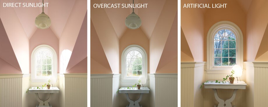
As seen here, bright midday sun will wash out most pale hues; that same hue will be flattered by softer, indirect illumination, while artificial light will add a warm glow to the wall colour.
"Influence the sense of space and dimension with the clever use of colour and sheen",
Helen Shaw, Marketing Director
Soften the contrast
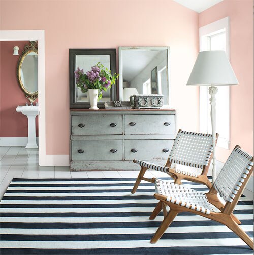
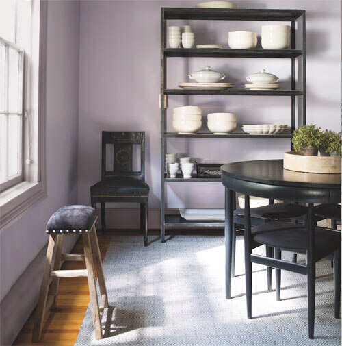
While its very common to use white on the woodwork alongside a colour on the walls, you can soften the look by selecting a white which shares the same undertones as your wall colour.
This technique is great when you want to make the room feel larger because the skirting and coving will appear more recessive than if a bright white is used, and won't draw the eye to the corners of the room.
It can be hard to spot the undertones in a white when it is surrounded by stronger shades, so make sure you isolate your swatches or samples from other strong colours and compare a few whites together to make the different undertones more obvious.
Perfect harmony
If you're keen to use a stronger colour in your space, but are worried about making the room feel dark, use our colour scales to pick a lighter and darker tone in the same colour family. Use the lighter tone on the walls and even ceilings, and darker tone on the woodwork. This will keep the space feeling bright but will give you a contemporary look.
With 7 colours in each of our colour families, the contrast between the two shades can be as small or as large as you like.
Create zones in open plan rooms
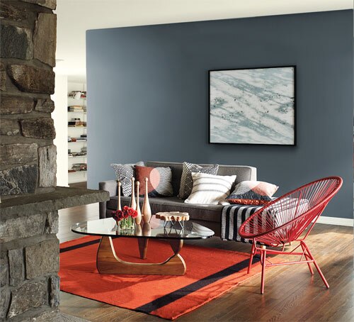
In an open plan home, use different colours to define different spaces and highlight interesting architectural features. But always keep the big picture in mind - the simplest way to keep things harmonious is to combine shades of the same colour - or tones from adjacent colour families - to give a sense of flow from room to room. Always think about which rooms have a line of sight from each other and be sure to pick tones that work together.
Create an illusion of space
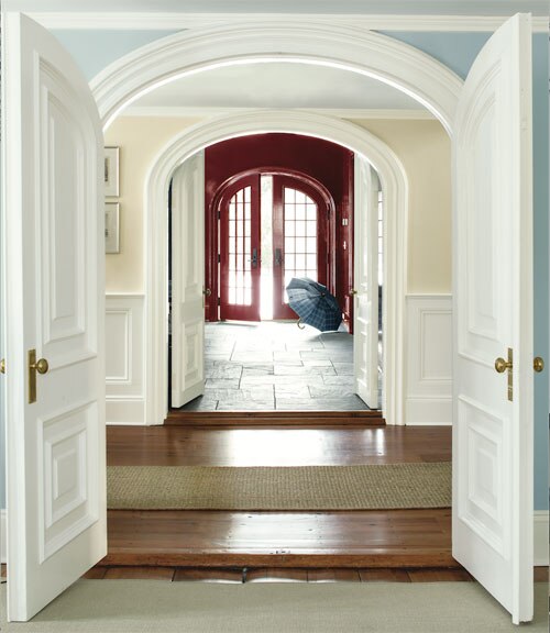
As a rule of thumb, lighter colours tend to receed making a space feel bigger, while darker colours tend to advance, bringing the wall towards you. You can use this to change the perception of space in a room.
If you are working with a long narrow space, like a hallway, you can use a darker colour at the end to draw the eye through the space and make the area feel more spacious.
Likewise, if you want to make a low ceiling appear higher, using the same colour on the walls, ceiling and coving will give the illusion of more height.
Depth and dimension
Sheen puts the finishing statement on your colour of choice, and with a line up of 7 sheen levels across our range, you can be as creative with sheen as you can with colour.
Flat and matte - lowest sheens, very forgiving if your walls are not perfectly smooth
Eggshell and Pearl - more durable and reflect more light, for woodwork or walls
Satin, Semi-Gloss and Gloss - luminous finishes that highlight architectural details.
Choosing the right sheen level can enhance your chosen colour. It can also mask or accentuate any different features or architectural details.
Painting the walls in a higher sheen level will add dimension and levity.
Using a higher sheen for example on a low ceiling will move light around the space and create the illusion of height. From a practical standpoint, remember that shinier finishes look best on smooth, well-prepped surfaces, while matte or flat paints are more forgiving of imperfections.
